J&E Homes
The CAST process

How J&E Homes was built.

01 C — Clarify

Two audiences. One brand. Zero room for a clinical default.

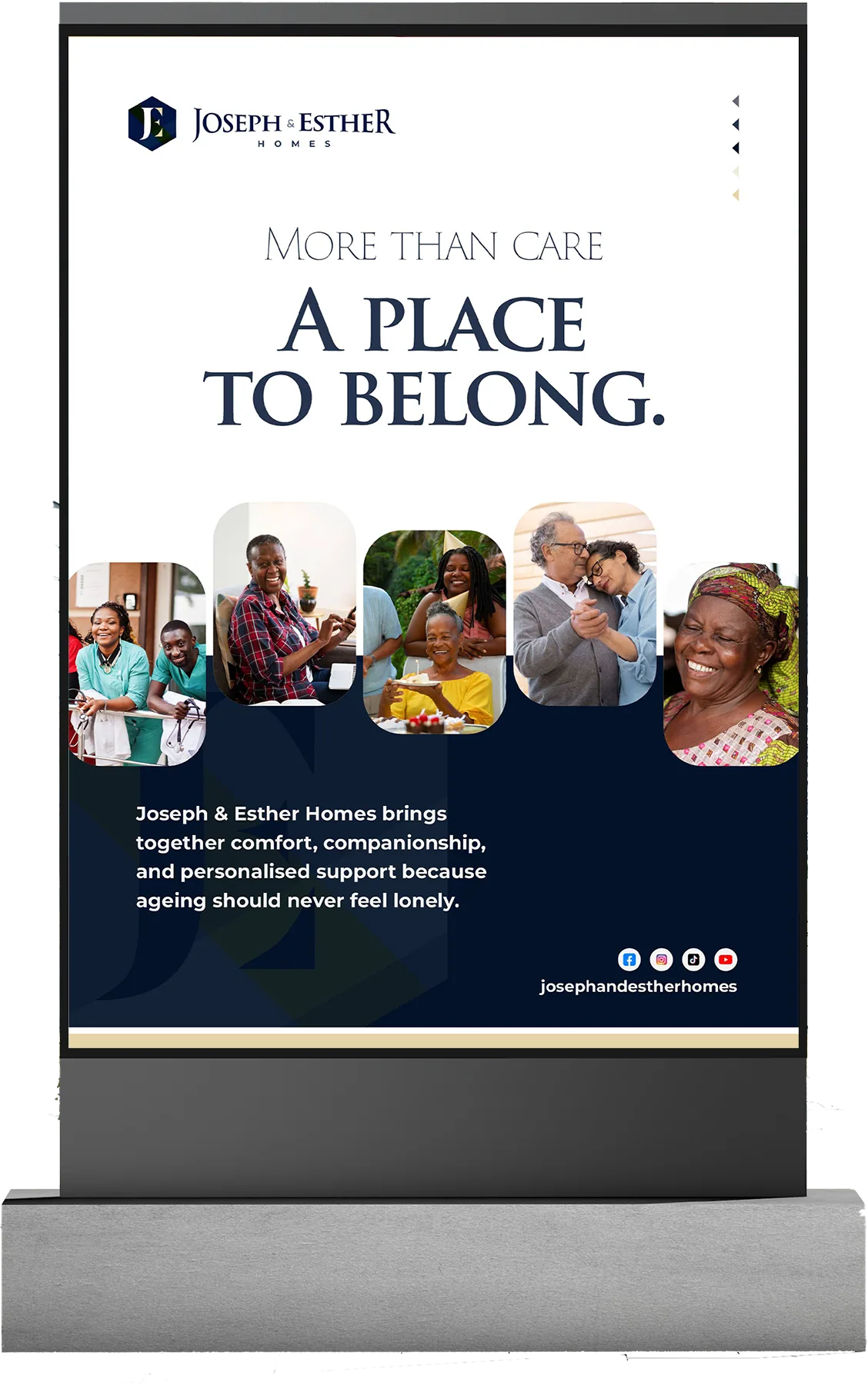
Senior-living in Nigeria carries the full weight of cultural expectation. Families choosing a care home feel duty unfulfilled — like they have chosen convenience over love. Discovery established that J&E had to speak to two audiences simultaneously: the adult children evaluating with anxiety and a guilty conscience, and the elders themselves who needed to feel honoured, not relocated.

Every visual default in the category — clinical whites, hospital blues, stock photography smiles — had to be abandoned. The brand needed to feel like a continuation of life, not a departure from it.
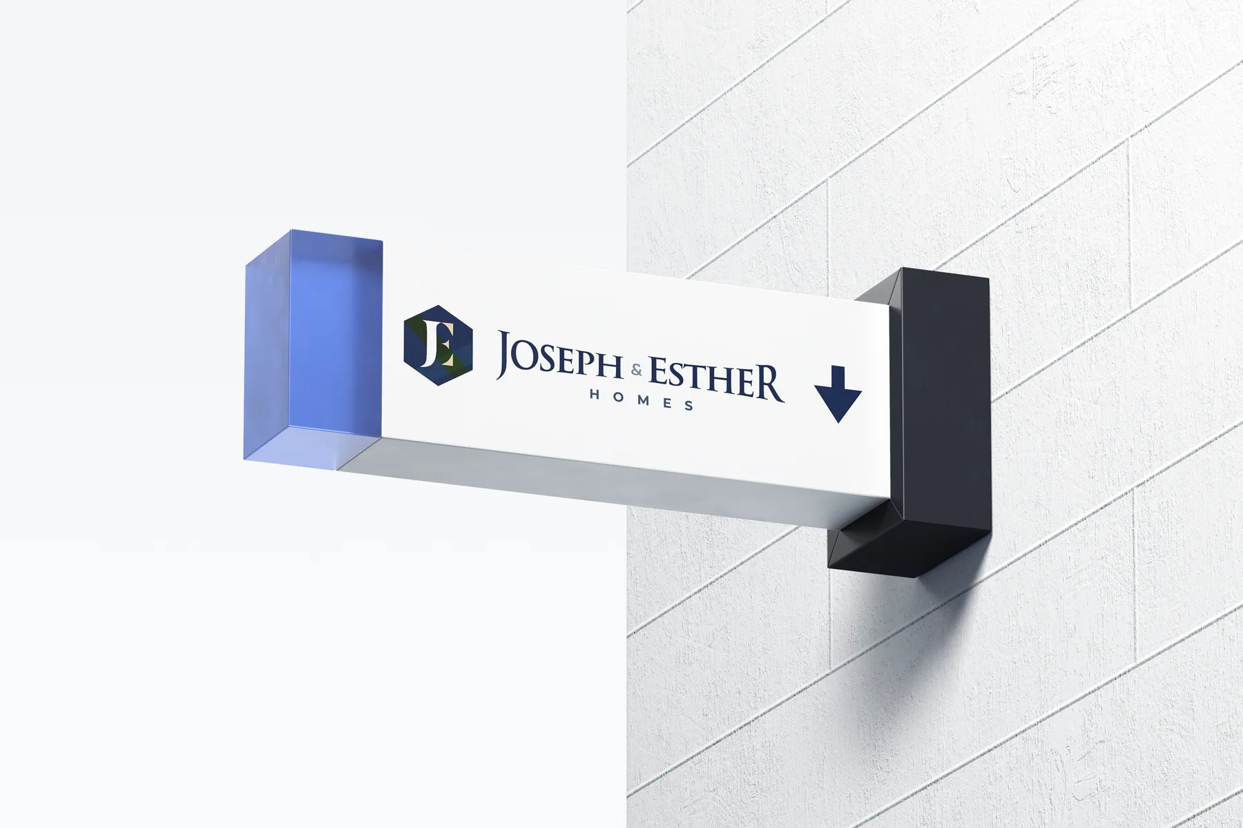

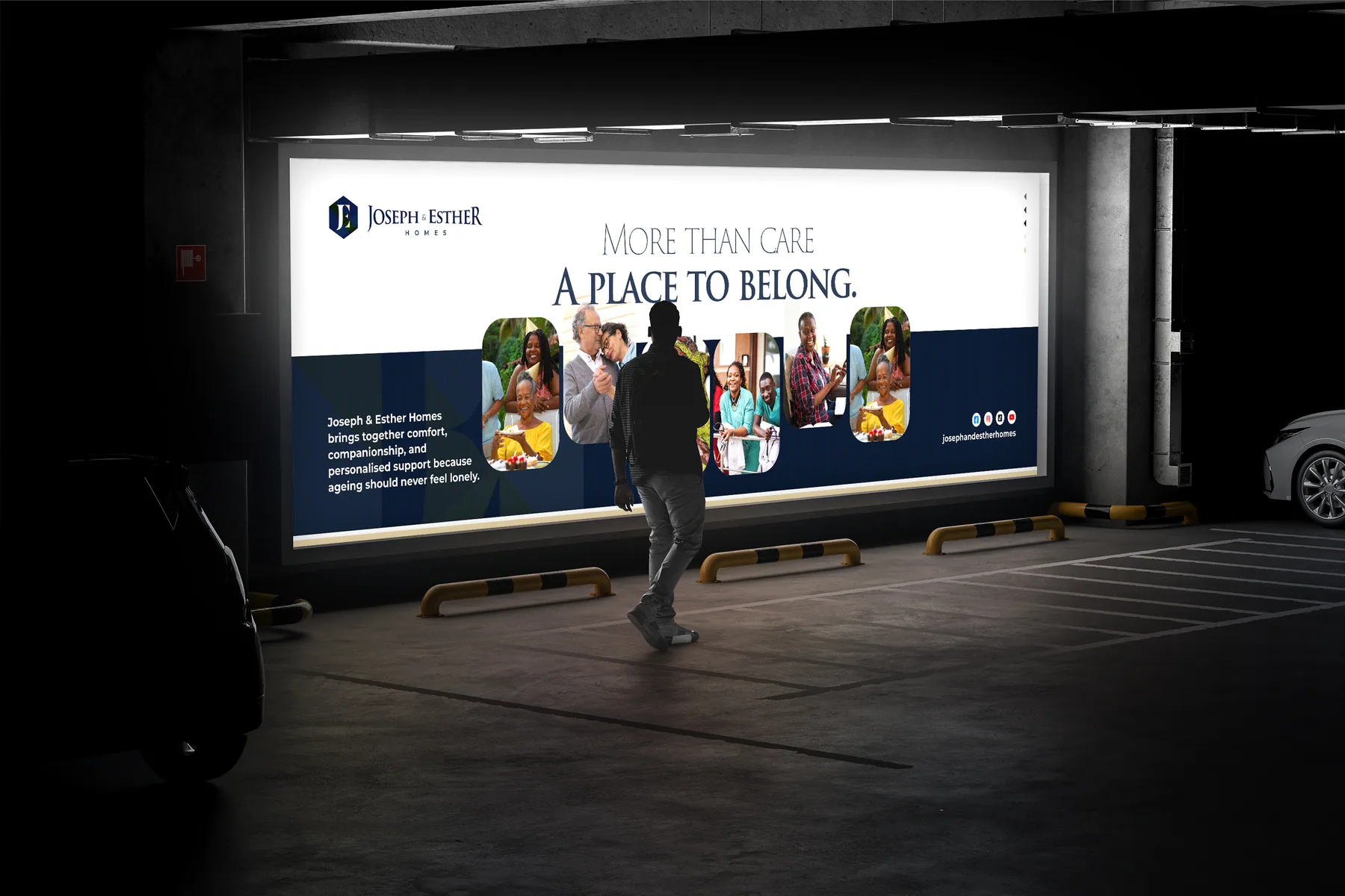
J&E Homes signage J&E Homes billboard
02 A — Architect

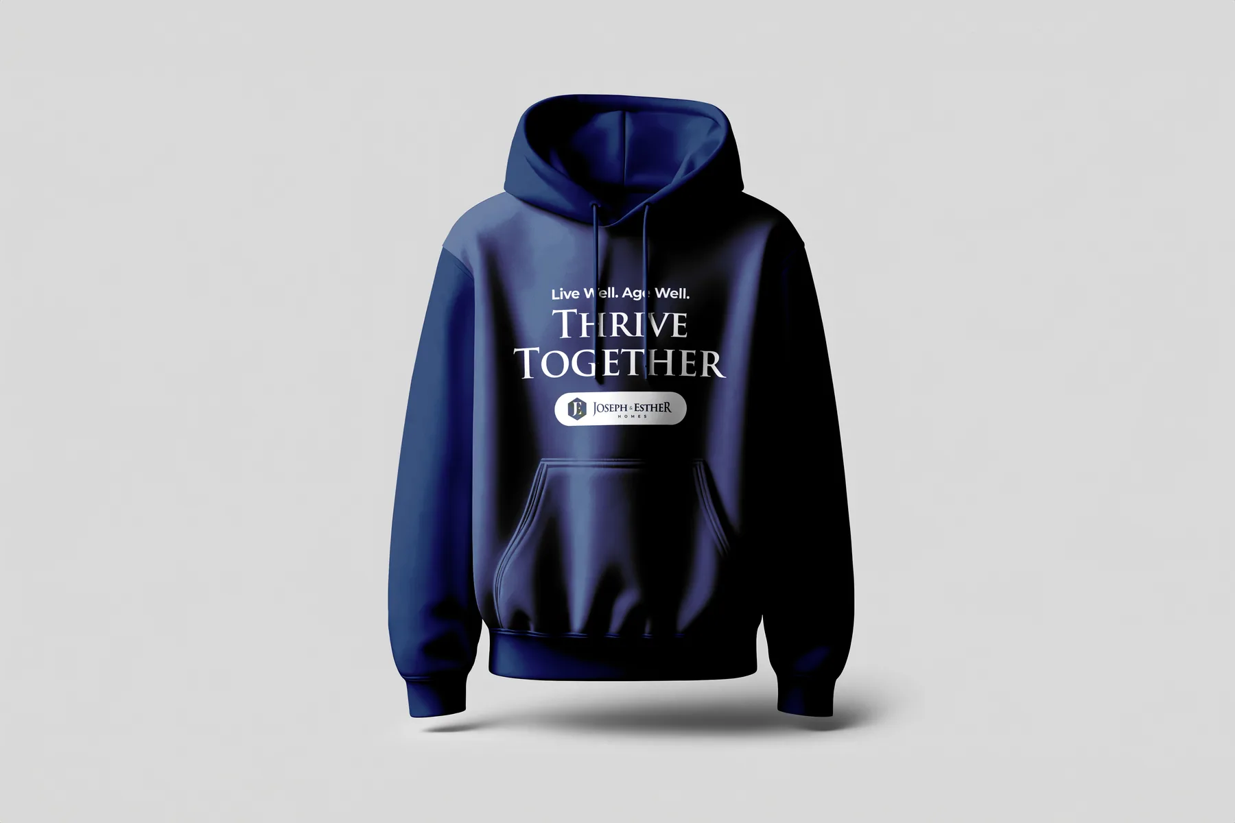
"Live Well. Age Well. Thrive Together." Not a tagline. The brand operating system.

The Architect phase built the full brand operating system. Positioning: senior living as continuation, not departure. The tagline sequence was deliberate — live → age → thrive — with "together" as the anchor that shifts the story from institutional care to community.

Brand Essence: "A Life of Dignity, Comfort & Community." Six service pillars established: Accommodation, Physical Care, Emotional Support, Nutrition & Meals, Engagement & Lifestyle, and Family Involvement — each load-bearing, none decorative.

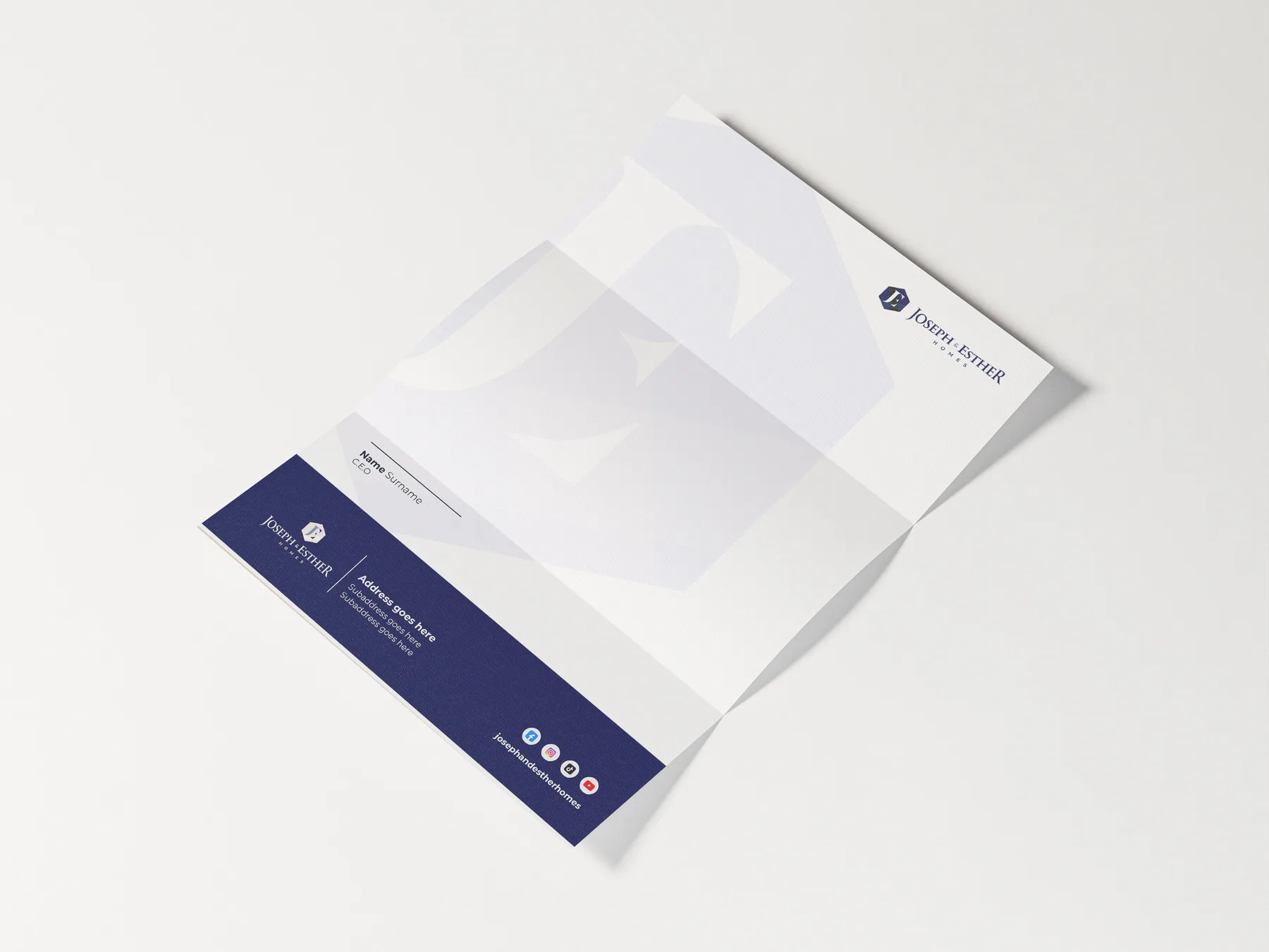
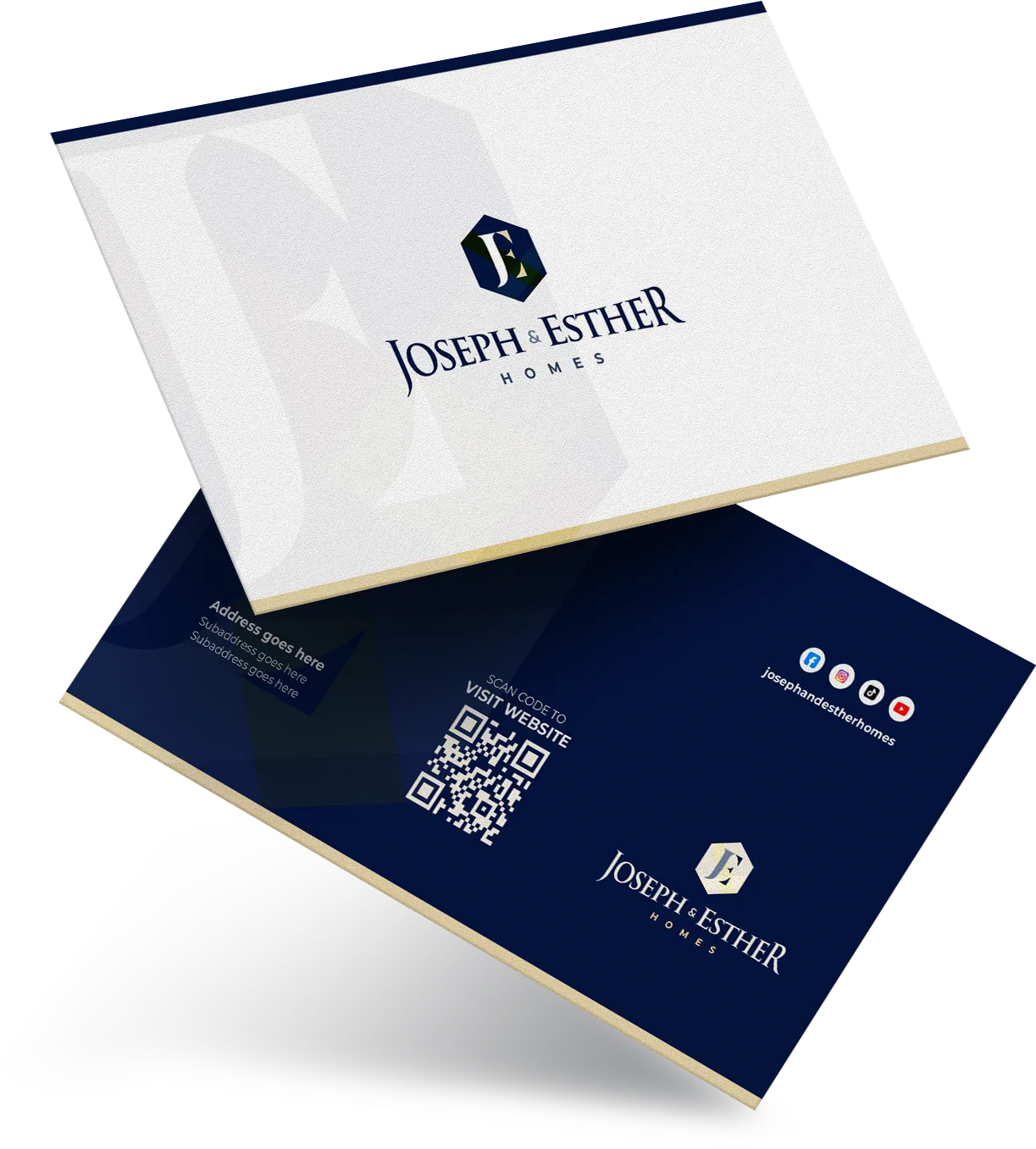
J&E Homes letterhead J&E Homes business card
03 S — Shape

A JE monogram anchored in a hexagon. Geometric yet warm, ordered but not clinical.

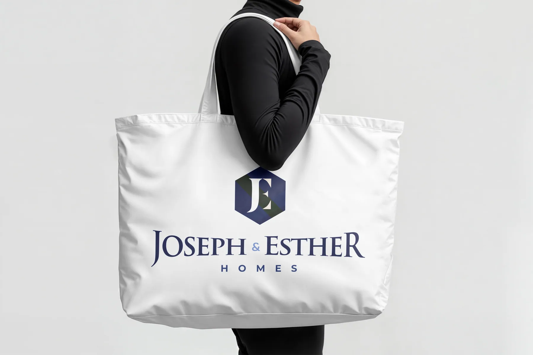
The Shape phase produced the logo system and full visual identity. The mark: a refined JE monogram (founders' initials) anchored within a hexagon — a form chosen for its balance, structure, and suggestion of holistic care. The hexagon is geometric but not cold; it becomes the signature visual unit across all applications.

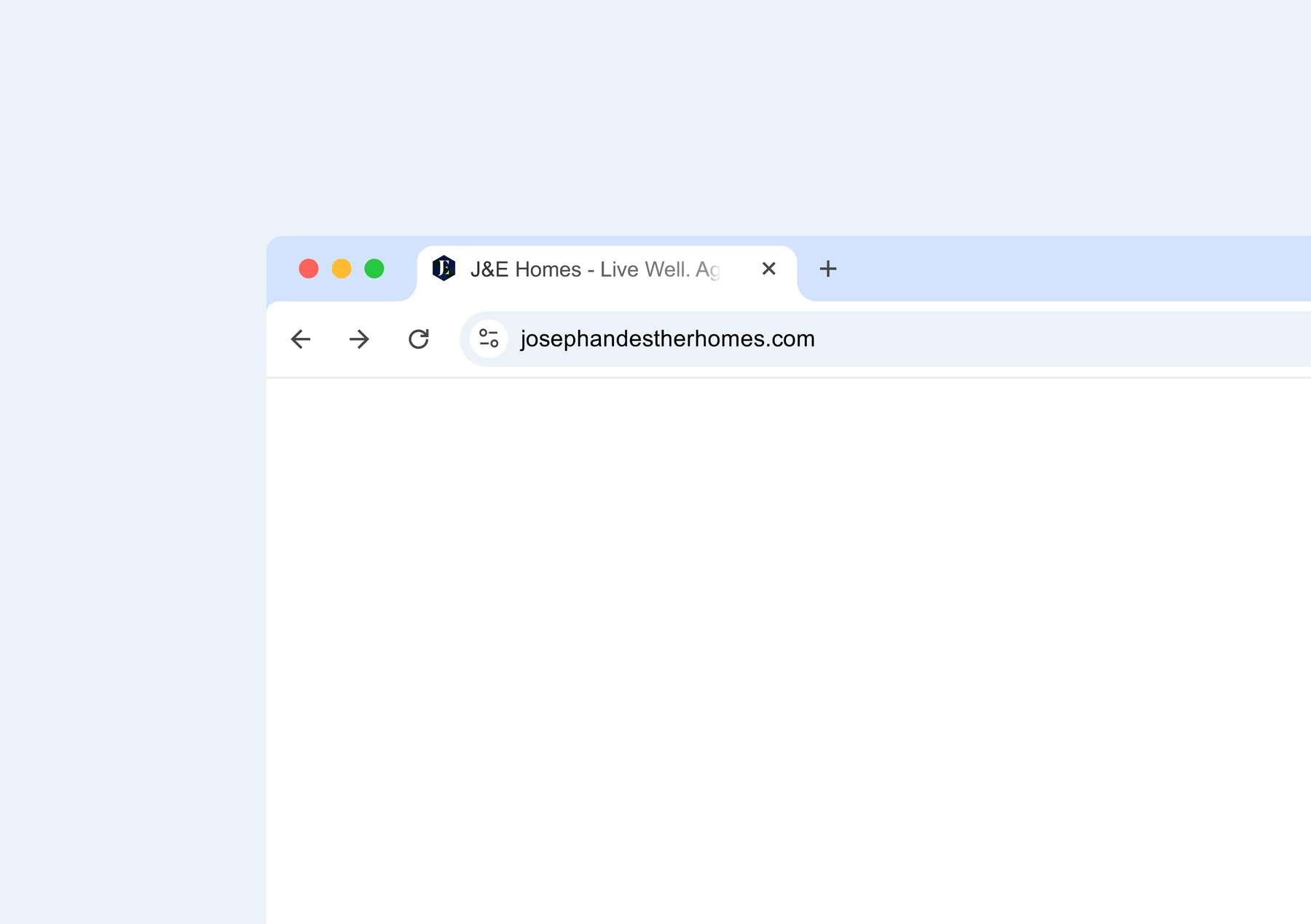
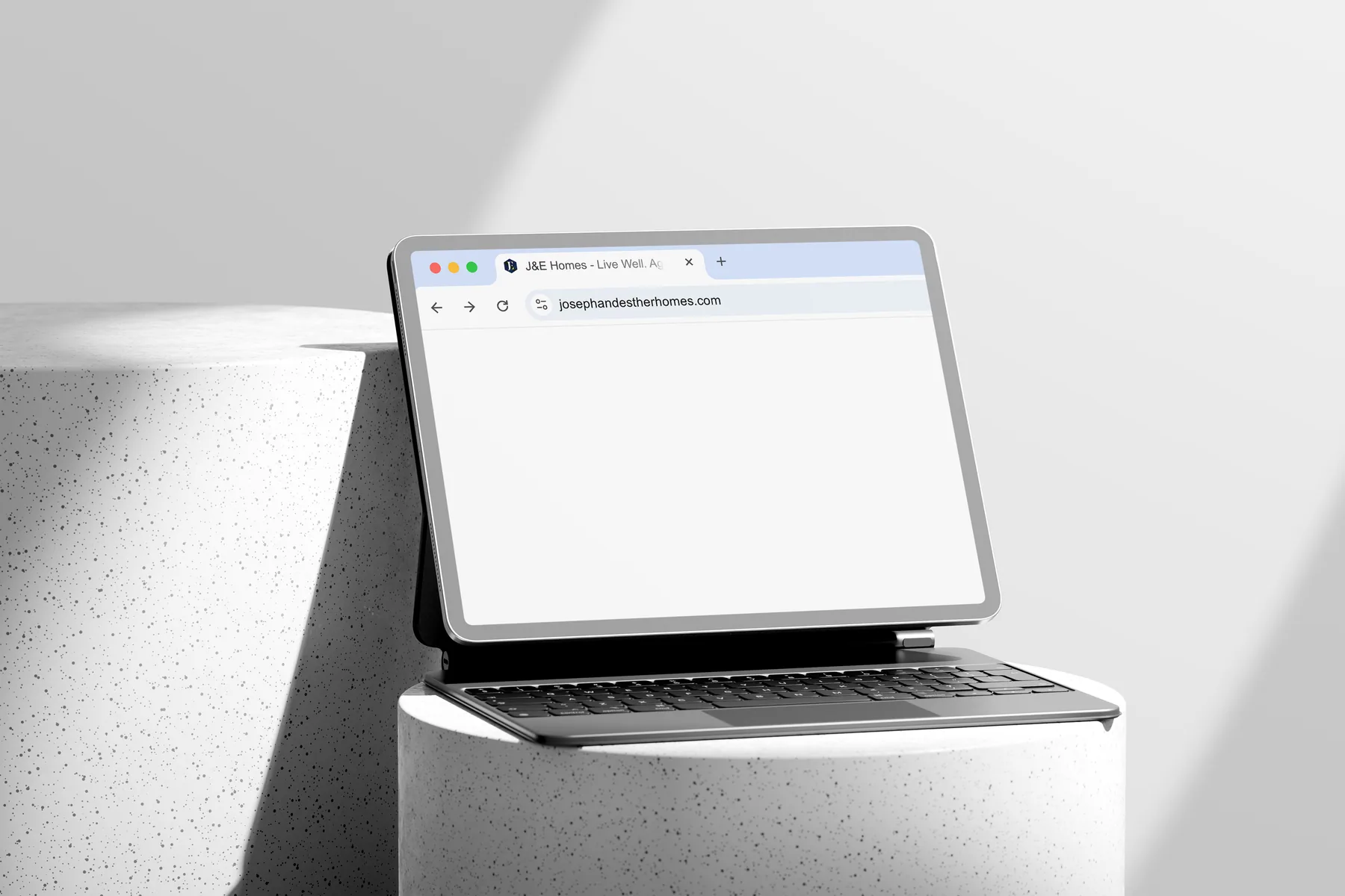
Deep Navy Blue + Warm Gold palette — rejecting both clinical whites and hospital blues. Typography: Trajan Pro 3 for headers (gravitas, heritage, permanence), Montserrat for body (clarity, warmth). The web presence was designed to match: immersive, editorial, high-trust.

J&E Homes web design
04 T — Transfer

A complete brand system, handed over. Not just delivered.

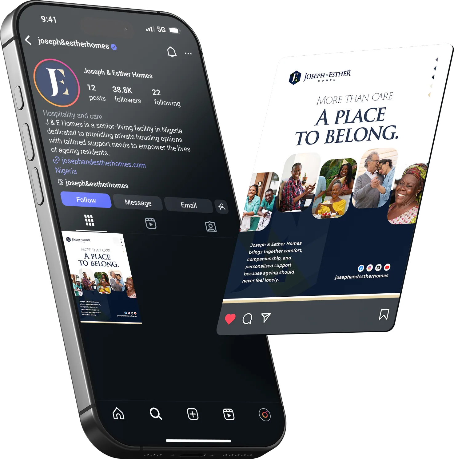
Transfer covered everything: full brand manual, complete logo suite with construction rules, stationery, apparel, signage, social media templates, iOS app icon and notification states, website, and a photography direction guide. Every deliverable was annotated with usage guidance.

J&E now owns a brand system that can scale from a single community to a multi-estate operation — with the guidelines to maintain consistency across every production run, without requiring the studio's involvement each time.

J&E Homes billboard J&E Homes Instagram
The system

Applied across every touchpoint.

J&E Homes brand application
Logo reveal
Next project

NAALEA 2026

View case study