OnGuard
The CAST process

How OnGuard was built.

01 C — Clarify

The sector defaulted to hazard red and reactive language. OnGuard needed to lead differently.

Petroleum compliance occupies a difficult position in operators' minds: expensive, technical, largely invisible — treated as a cost center, not a strategic asset. The sector was dominated by red and orange hazard palettes, generic shield icons, and emergency-tone messaging.

Discovery established the opportunity: reposition compliance as proactive protection, not reactive containment. And build a sub-brand under Empire Petroleum Services that could carry that message independently — "OnGuard — Powered by Empire Petroleum Services."
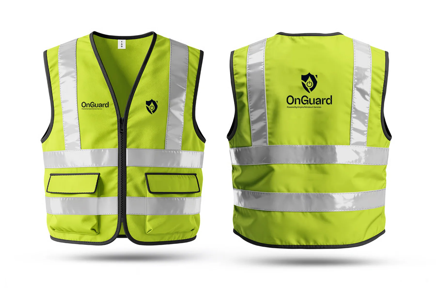
OnGuard safety vest
02 A — Architect

"Always On. Always Compliant. Always With You." Three pillars, one operating principle.

The Architect phase built the full brand operating system for OnGuard. Three strategic pillars: Always On (continuous monitoring), Always Compliant (proactive adherence), Always With You (partnership, not just service). Each became a service tier: Gold (1-year), Diamond (3-year), Platinum (5-year).

Target audiences identified: site managers who need field-ready clarity, procurement officers who read brand quality as a proxy for service quality, and corporate health & safety teams who present internally. The brand had to hold in all three contexts simultaneously.

03 S — Shape

A shield built from three ideas: authority, protection, and energy. Blues, not hazard red.

The Shape phase produced a mark engineered for industrial application. A shield form incorporating a power symbol and flame-droplet — three layers of meaning: regulatory weight, active monitoring, petroleum industry. Every element tested for legibility on hard hats at 5 metres, embroidered on vests, and printed on business cards at 9mm.

Palette: Midnight Navy, Deep Blue, Signal Blue, Sky Mist — deliberately replacing the category's red-and-orange hazard language with a system that communicates authority through confidence, not warning. Random Grotesque Semibold for maximum field legibility.

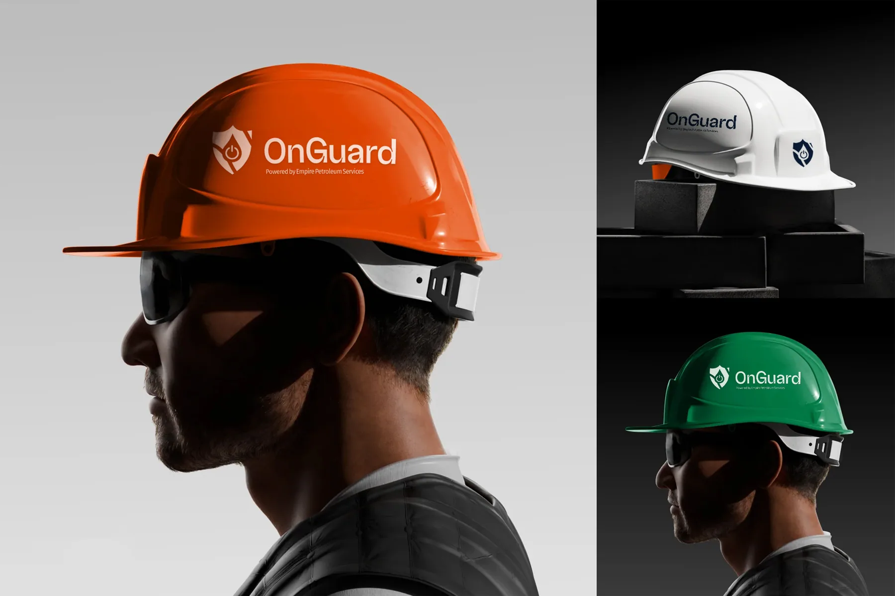
OnGuard hard hats
04 T — Transfer

Hard hats, vests, gloves, uniforms, and a marketing flyer that sells the service tier system.

Transfer covered the complete brand asset package: hard hat artwork in three colour variants (orange, white, green), safety vest embroidery files, branded work gloves, apparel, and vehicle livery specifications. All files delivered production-ready with usage notes per application type — reflective print, embroidery, screen print, and digital.

A two-page marketing flyer was developed alongside the identity: page one leading with the question "Is Your Fuel Station Truly Compliant — or Just Hoping It Is?" and page two presenting the service tier comparison in a skimmable, jargon-free format. Brand manual included for all future production.

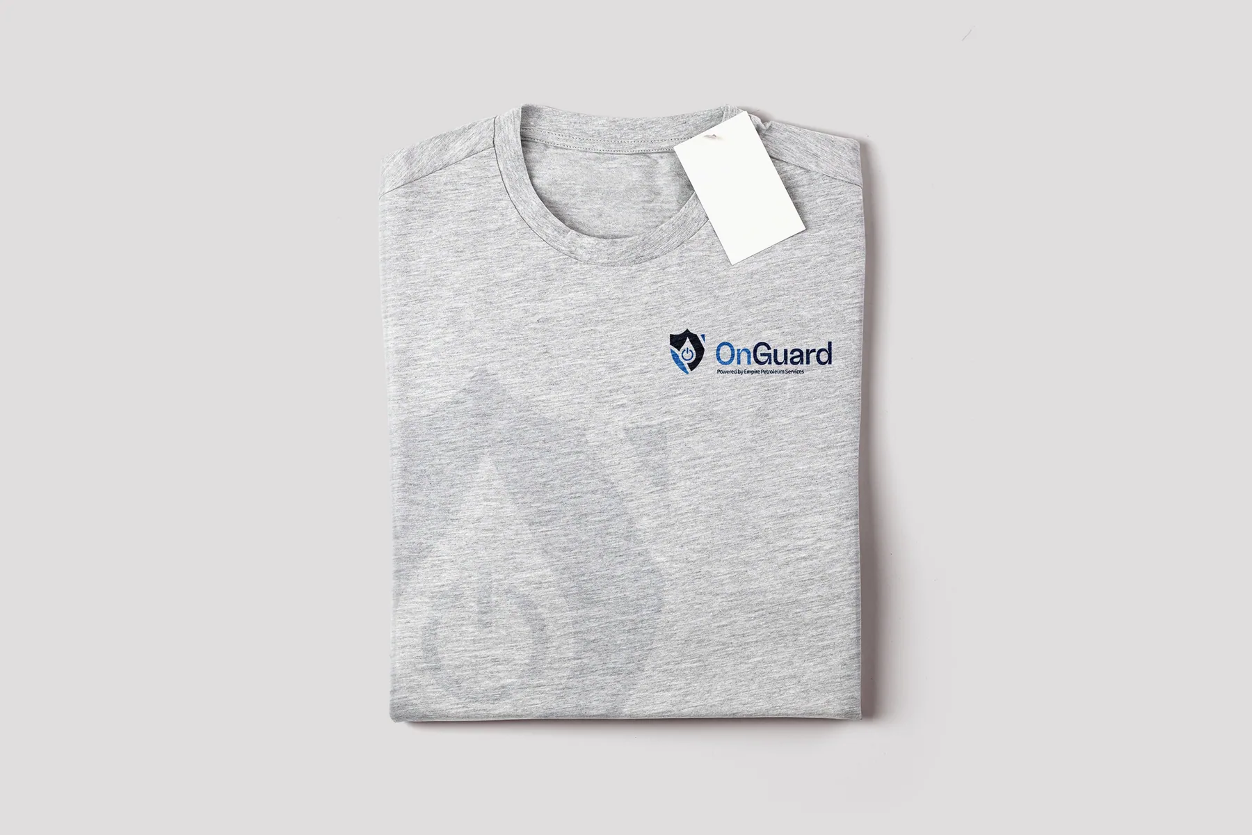
OnGuard t-shirt OnGuard hard hats
The system

Applied across every touchpoint.

OnGuard brand application
Next project

Obaomi

View case study